🏫 Sydney Uni App Redesign
University life is overwhelming enough—add scattered, outdated, and irrelevant information across multiple platforms, and it’s a real struggle for Sydney Uni students. As Product Designer, I tackled this challenge, clarifying the app’s purpose and prioritizing user needs to create a seamless experience that truly connects students to campus life.
To respect my non-disclosure agreement, I have omitted confidential details in this case study.
here’re the impactful outcomes:
And More Numbers
Monthly Active Users
Engaged Sessions Per Active User
User Stickiness
🧢 My Role
As the only Product Designer working 100% on this project, I wore many hats.
📽️ Previously on Sydney Uni
The Sydney Uni app was first launched in 2012 to complement the university's digital ecosystem beyond academic and external-facing informational platforms. Over the years, the app underwent several iterations and integrations. By 2021, the pandemic had rapidly accelerated the evolution of digital experiences, and the app began to feel outdated, clunky, and confusing for users.
In 2022, aligned with the university's strategic goals, the Sydney Uni app embarked on a complete redesign. It was at this pivotal moment that I joined the team as a Product Designer and helped to reimagining the app from the ground up.
Kickoff
From Chaos to Clarity: Identifying Key Gaps
At the start of the project, the team was ambitious and had many ideas but lacked a clear direction. As a newly joined designer, my first step was to engage with stakeholders to understand the current state of the project and gather their requirements and expectations.
key inputs from conversation with stakeholders
Fragmented Experience: Existing research reveals that the current user experience is highly fragmented, with systems operating in silos. While a key university strategy in digital sector is to consolidate multiple platforms.
Personalisation: Delivering a more personalised service experience for students is a primary project goal. Preparations for integrating machine learning technologies are already underway.
Visual Design: The current UI is outdated. Stakeholders expect a clean, modern interface that also reflects USYD’s distinctive identity.
Preserving Existing Content: According to business requirements, although the app will be rebuilt from scratch, most of previously developed features and content must be migrated to the new version.
😵💫
Each semester week
A coursework student uses around 10 platforms and systems
A research student uses around 25
Discovery
Users at the Center: Advocating for Insights Beyond Strategic Goals
At this stage, another Senior Designer joined the team. To better understand users, their real struggles with the app, and potential pain points in their university journey that could inform redesign opportunities, I collaborated with him to conduct Voice of Customer interviews with 10 students from diverse degrees, faculties, academic years, and backgrounds.
After grouping the findings through empathy mapping, the key insights are as follows:
App Usability Issues
Repeated multi-factor authentication (MFA) discourages use.
The app mostly duplicates information available elsewhere, making it feel redundant.
Content and features within the app often feel irrelevant to users.
Poor user interface design hinders navigation and usability.
Performance issues include slow loading times and frequent bugs.
Difficult to find the answer
Difficulty finding answers due to confusing university jargon.
Overwhelming textual content requiring long-time reading to locate needed information.
Inconsistent information across various pages and platforms.
Students often prefer asking peers or faculty members instead of navigating the website.
Communication Gaps
Students frequently miss opportunities (event, scholarship, job…) due to poor communication.
Important dates and events are often overlooked because of a lack of reminders or notifications.
Emails, the primary communication channel, are disliked for being too long and cluttered with promotional content.
🤔️ Some other interesting findings
Through conversations with students and looking into other university platforms, we uncovered:
Although students have no choice on university's non-academic internal tools, their tolerance for these tools is still low. Some even choose to leave issues unresolved rather than engage with the tools. But at the same time, their expectations for these tools are also low, as they have become accustomed to frequent bugs.
Many platforms and systems in the university aim to be "one-stop shops," but most end up functioning as ‘link banks’. Worse, a lack of maintenance leads to outdated and inconsistent information coexisting across different locations, causing confusion.
😮💨
We provide plenty of information, yet users still feel a lack of communication and continually miss out on key details.
Redesign goal
Driving Alignment: Sharpening the Product’s Vision
We shared our research findings with stakeholders, who were then closely involved in narrowing down the project goals to ensure alignment with our vision.
Experience Outcome (XO):
I want to know all the things my uni can do for me
I want to find the answer to my questions quickly
I want to find my way around campus easily without having to ask anyone
I feel connected to my university
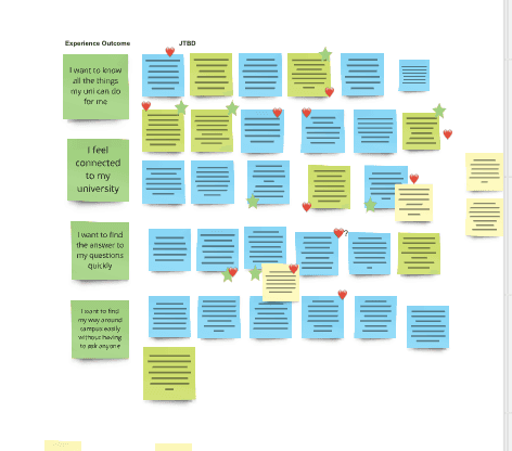
Ideation workshop
From Challenges to Concepts: Designing Around JTBD
With our design direction in place, we hosted a brainstorming workshop with other designers from our Design Practice. Through dot voting, we selected solutions that not only addressed user needs effectively but also laid the groundwork for future incremental changes.
Rapid Prototype
Yes, I admit our sketches weren’t masterpieces—and our stakeholders might have thought the same. To quickly align on our concept solutions and provide clarity on potential areas of involvement with everyone, we created rapid prototypes of the app’s key feature screens. Together, we shaped a concept that is both feasible and adaptable for future needs.
🚗 Navigation
We kept the calendar and map—two of the most complex yet popular features. Home serves as the main hub for passively accessible information, while Search now has its own tab for answers that users need to actively search for. Redundant text and poorly integrated features have been deprioritised to focus on what users find valuable and functional.
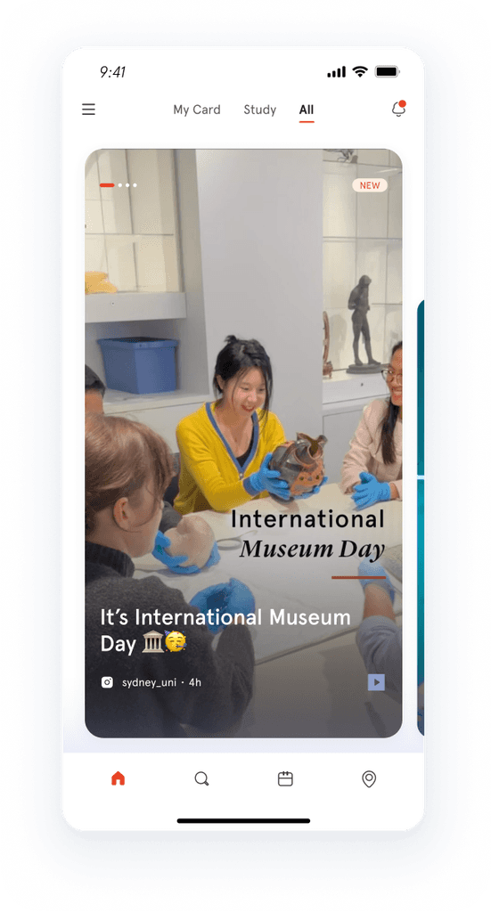
🏠 Home
The Home tab features an innovative swappable card design, dynamically optimised through machine learning to align with user behaviour, preferences, semester milestones, and popularity trends. Each card delivers bite-sized information, with swipe gestures enhancing the experience of passive information consumption.
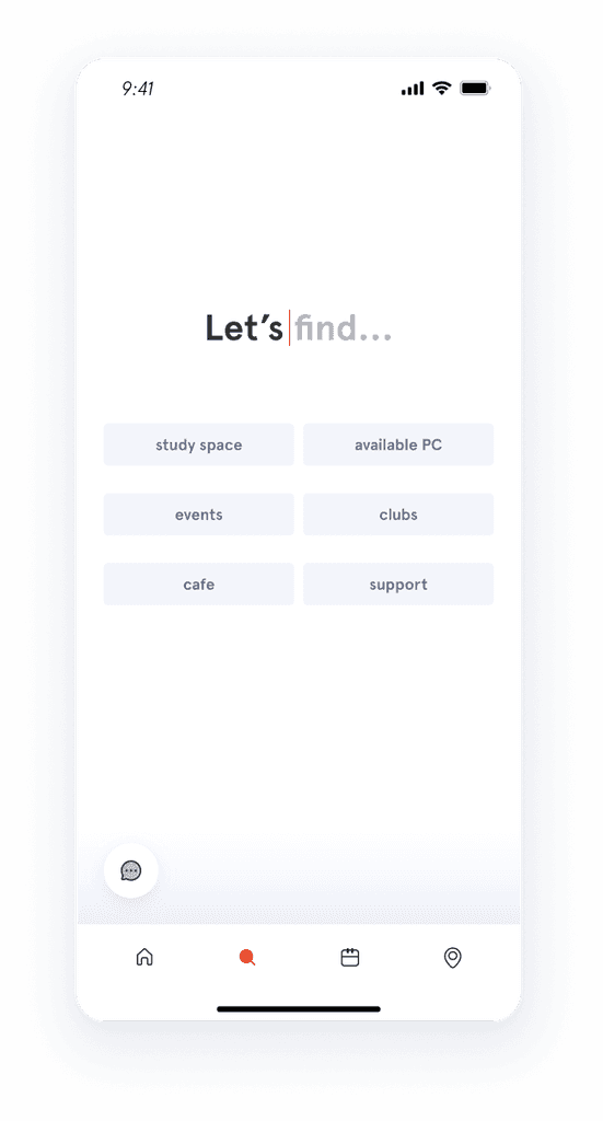
🔍 Search
In addition to the basic search bar, recommended search keywords are also included, enabling users to quickly find the information they may need. These keywords are also personalised using machine learning.
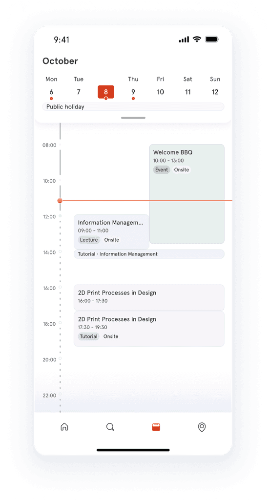
📅 Calendar
A simple yet comprehensive calendar consolidates all relevant events—classes, exams, meetings, key university dates, deadlines, and appointments—in one place. One calendar is all users need!
📍 Map
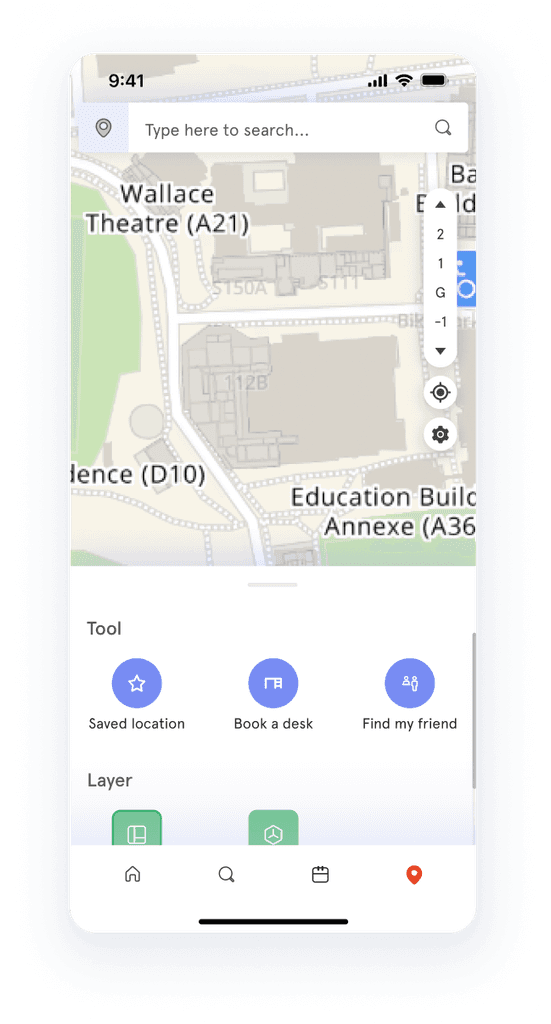
A seamless door-to-door navigation experience ensures users no longer get lost in complex campus buildings. All location-based content in the app allows users to start navigation with a single tap.
📱UI
A clean, modern, and minimalist look. It aligns with the university’s identity while distinguishing itself from the external-facing informational website.
Validation
Turning Assumptions into Confidence
We were concerned that the new interaction model might confuse users and deprioritising existing information could cause anxiety. To address these risks, we conducted prototype testing with both existing Sydney Uni app users and students who had never used the app before to gather their initial reactions. The results were overwhelmingly positive, with the following key takeaways:
Users adapted to the new app surprisingly quickly. They found the swiping interactions engaging and described the overall experience as enjoyable. Many expressed excitement for the app’s release.
Users felt more confident that the new design would help them avoid missing or being unaware of important information they want or need.
Users didn’t notice the removal or deprioritisation of certain content. They found the navigation clear and felt that the features they needed were well-presented.
The only concern raised was uncertainty about how relevant the card content would be to their individual needs.
Delivery
From Big Picture to Fine Details
The positive results greatly increased our confidence, and the entire team now shares a clear and unified vision for the product. However, my work doesn’t end here—great design also needs to be implemented properly.
Design Contribution:
The tip of the iceberg of an extensive design file
Capturing bugs and providing suggestions
More Details:
Given the current resource capacity and technical constraints, achieving the future state in a single step wasn’t feasible. As a team, we agreed to focus on which significantly impact the user experience in the first redesign phase. My contributions included:
Home: Since machine learning has yet to be implemented, we utilised existing APIs to ensure dynamic content delivery. To maintain high-quality information for students, I developed a student-centric content guideline aiming at timely, actionable, and beneficial content. Additionally, I provided experience-related input to support the developers' work on personalisation.
Calendar: I maintained a basic timeline design while focusing on investigating and designing the integration of valuable data from various sources to enhance usability.
Map: I focused on resolving usability issues from the previous version, which were caused by a lack of design during earlier integration. For example, I restructured the search-to-navigation flow, which had caused performance delays due to messy interaction logic.
Performance: I introduced skeleton loader to ensure a smooth experience.
Content is a vital part of the product. I developed guidelines from a user-centric perspective.
I created a clear pathway for map usage—intuitive for users and free from technical clashes.
Continuous research
The first launch is a great milestone, but it’s not enough to make our product an award-winning app. We continue gathering VoC feedback, conducting surveys, and even having conversations with random students on campus. We share our findings with the team in a simple and clear way, ensuring each iteration resonates better with real users.
Mapped pain points (top) and
shared insights with the team (bottom)
Continuous iterate
Exciting updates ahead! We've lost count of how many changes we've made or plan to make. As a product designer, I’ve been closely involved in the iteration process from start to finish (or, perhaps, never-ending). Here’s a sneak peek:
🚀 Shipped
Event Suggestion
🔧 In Flight
Widget for iOS
✏️ Concept
Rich Search Results
Finally…
and most importantly, I couldn't have done this without the support and contribution of the whole team. Throughout the project, every team member put in tremendous effort. Their passion and dedication to the product have been the foundation of this success. I'm truly grateful for everyone's hard work and contributions.


