Official Website Redesign
Right after graduation, I applied to become a Project Intern. In this team, I listened to the needs of the product owner and cooperate with the marketing team and outsourcing developers to redesign the official website.
Problem
Our website is not attractive enough for our clients. Users get lost when navigating through the pages.
Solution
Improve the information architecture and website content. Redesign the UI.
Role
UX & UI Designer
Time
1 months
Stakeholder
Michael Campbell (Product Owner)
Rory Brittain (Graphic Designer)
Ethan Chan (Marketing Intern)
👩🏫
My Impact
As the time and budget were limited and I was the sole designer in this team, I utilized the existing resources and led the redesign process. Due to pandemics, we work remotely. I listened to business needs and identified the design opportunities via competitor audit. Overall, the proposed changes can provide an easy-to-use experience, increasing the purchase probability to some extent.
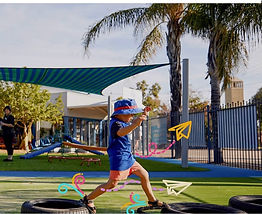
Virtual Teen Sitting
Virtual Teen Sitting was created with the intention of making childcare more accessible, convinient and even safter than traditional baby sitting.
Covid-19 demonstrated the growing power of technology in facilitating personable interactions. The convenience of working from home was appreciated by many, as demonstrated by the Remote Work Survey 2020 indicating that 92% of people would like to continue working from home in a post-COVID world.
Research
Research Objective
Our website is not attractive enough for our clients and doesn’t convey the appropriate sense.
We considered the demand of our end users and audited industry competitors to find effective improvement plan
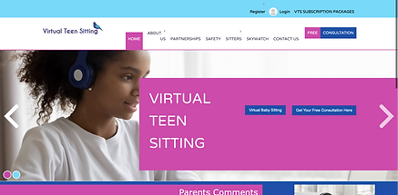
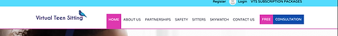
Before redesign
Service Scope

Virtual Sitters (Main)
Virtual Teen Sitting provides one-on-one virtual childminding services designed specifically for teenagers. This allows for low-stress, high-quality interactions.

Sky Watch Product
An innovative multi-functional wristwatch, SkyWatch connects to emergency contacts and instantly notifies them when required.
VTS's Unique Value Position
A professional & high-tech team
who care children’s
Academic & Mental Health Development
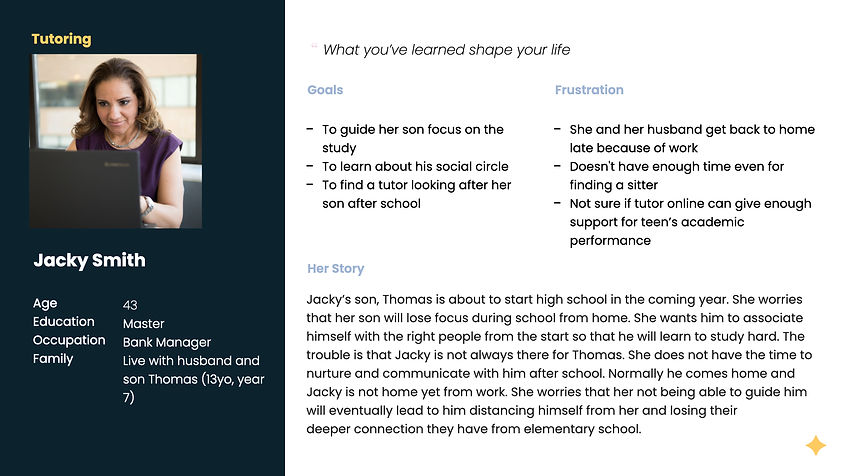
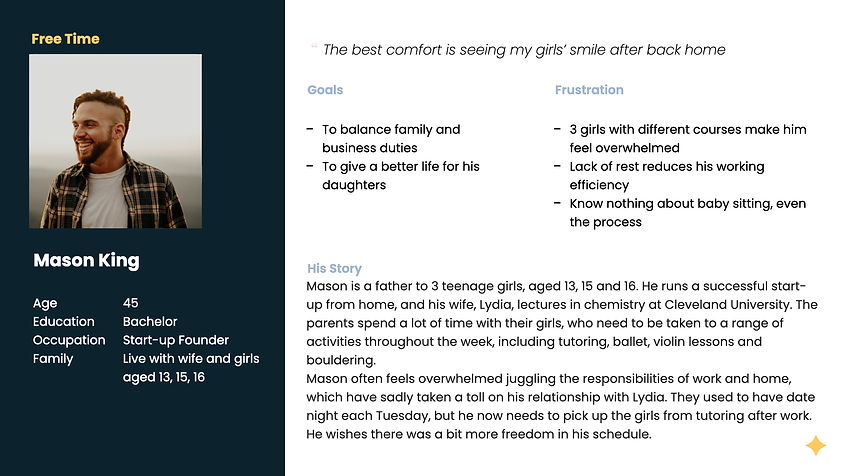
Persona
I developed the persona based on the pre-obtained users' stories from the marketing department.

Competitor Analysis
Questions
Did their website build trust?
How does their website feel? Does the design complement the product?
Will user get confuse during navigation?
Procedure
We review these aspects of each websites design:
-
Audience
-
First thought
-
User Interaction
-
Visual Design
-
Content
Competitor A
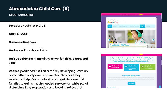
Strength
-
Provide trustworthy feedback from clients
-
Keep the navigation simple and clear
-
Have clear brand identity

Weakness
-
Visual outcome cause reading difficulties
-
Cannot remember the info of kids
-
Lack of tutor’s info
Competitor B
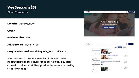
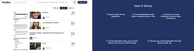
Strength
-
Consistent design convey professional feel
-
Sorting feature help narrow down the target tutor
-
The booking process is clear presented

Weakness
-
Incomplete sitter’s info cannot built trust
-
Inconsistent navigation
-
Cannot track the schedule
Competitor C
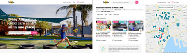
Strength
-
Engaging and fun user experience
-
Hierarchy is clear and navigation is simple
-
Visual/text are well-balanced and consistent
-
The search result is well displayed

Weakness
-
Accessibility design is incompatible
-
Some interactions’ feedback are missing.
Ideation
By matching the user needs to existing solutions, I identified several design opportunities.
About Visual
Beneficial for building trust & Reduce reading difficulties

-
Improve layout
The inappropriate layout emphasis unimportant content.
-
Balance the colour ratio
The existing website used a large quantity of highly-saturated colours. It looks unprofessional and causes reading difficulty.
Existing website for VTS
-
Keep images consistent
Due to the limited budget, our images are mainly from free image websites. In this case, they need further processing to be in the same style. A trick I learned from competitor C is using repetitive/same style elements as stickers for different images.
About Content
Make experience clearer and trustworthy

-
Tell the story
Both competitors A and B tell the stories about why they want to provide remote sitting services and their core values. In this way, the connection between parents and us will be established in the first impression.
-
Clarified the process
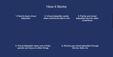
Users will feel unsure or confused without instructions when booking. Need a How It Works part to lead them.
-
Improve comment section
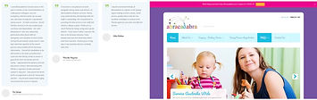
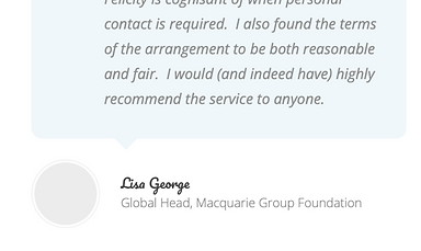
Competitor A uses clients' full names, locations, headlines, and direct quotes to increase credibility.
About Main Features
Easier interaction
-
Improve the hierarchy
Users get confused when navigating through the pages. The text is not intuitive and the hierarchy is messy.
-
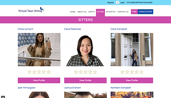
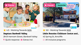
Improve the sitter list
The previous list did not allow users to obtain effective information directly. I learned from competitor C that uses tags to emphasize the strengths of sitters that users can match themselves with sitters quickly.
-
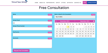
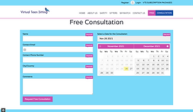
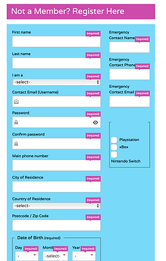
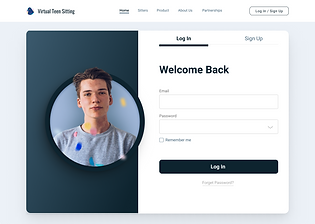
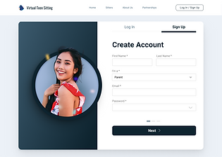
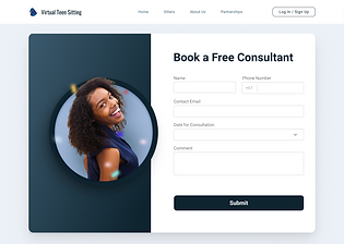
Improve the register/booking page
The provided forms are lengthy and overwhelming. Need redesign to make them clean.
Deliverables
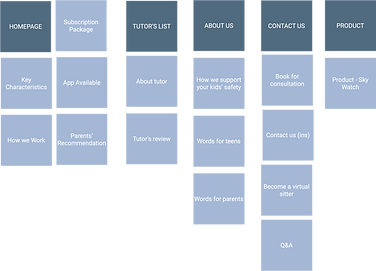
Information Architecture
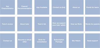
I break website content into different sections, and invite other interns to reconstruct information architecture via Card Sorting
Design System
Based on the provided colour palette, I developed a basic design system.

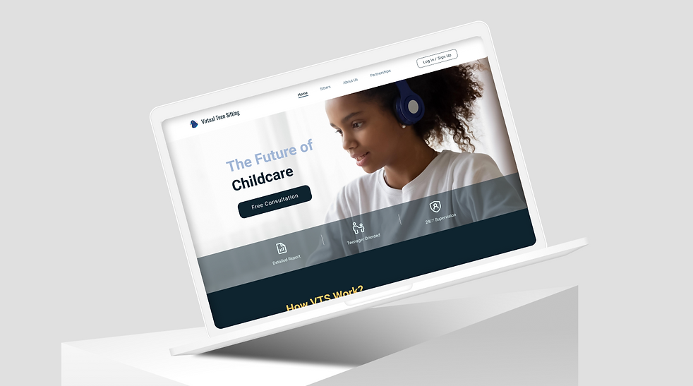
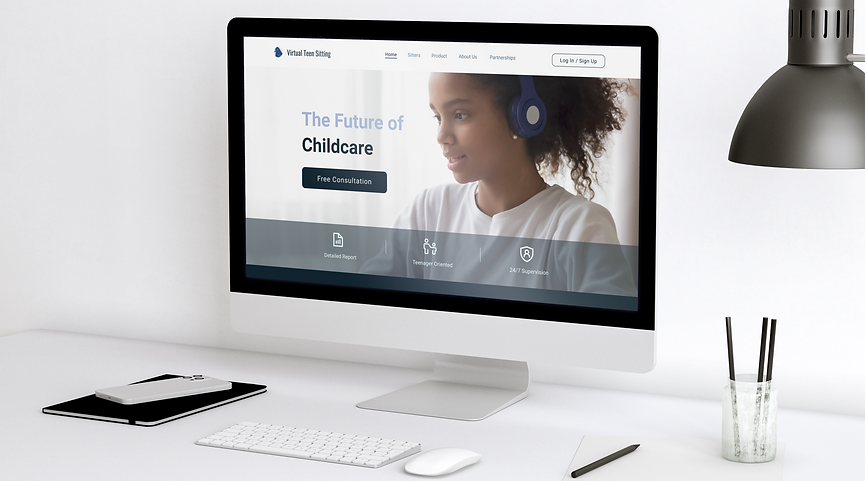
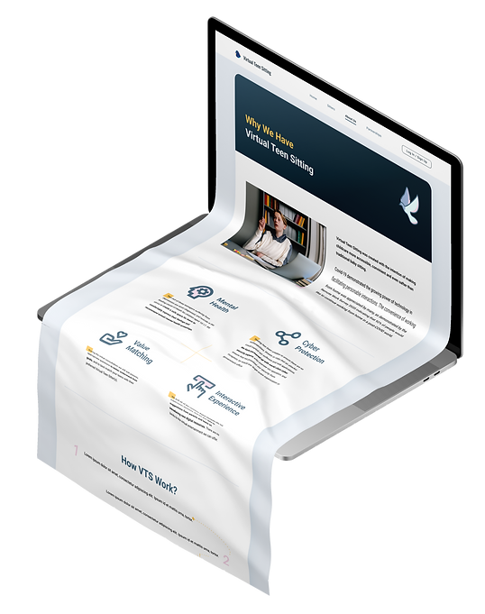
Final Mockup
Provide users with
a comfortable reading condition
Telling the Audience we are
Professional & Trustworthy

Use story to create connections
Creditable feedbacks
Make user experience
Easy & Efficient
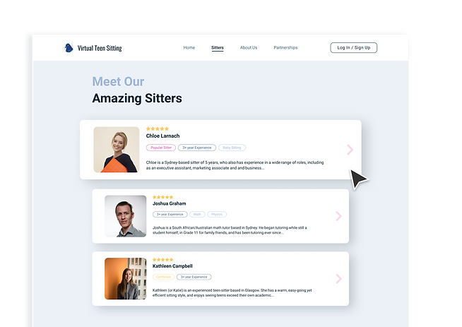
Tags make reading effective
Seamless experience
Reflection
💡 Although the journey is short, I learned a lot from it.
-
It's my first time not starting from scratch, but improving the existing product.
-
By cooperating with the marketing department and graphic designer, the redesign went on smoothly.
-
When I encounter difficulties like website design standards and visual communication, I seek help from senior designers.
-
Be brave and confident to challenge myself by pushing the limitation!
🥊 However, I know there must be something I can do better!
-
I did not have enough time to finish the Personal Center. Producing a fluent and easy to use dashboard is a great opportunity to show our professionalism.
-
Although the goal of this version's visual design is to emphasise our core value and build trust, the style might be too serious for young teenagers. It can be improved by decreasing the use of primary colour or adding cute elements like childish drawings.
-
The booking process can be further simplified by optimizing the service flow.